Overview #
A chart is a visual depiction of a section of data, e.g., in the form of a vertical or horizontal bar chart, a line chart or a pie chart. For convenience, we loosely speak of a key performance indicator (KPI) and a pivot table as charts.
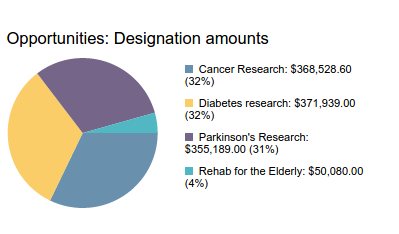
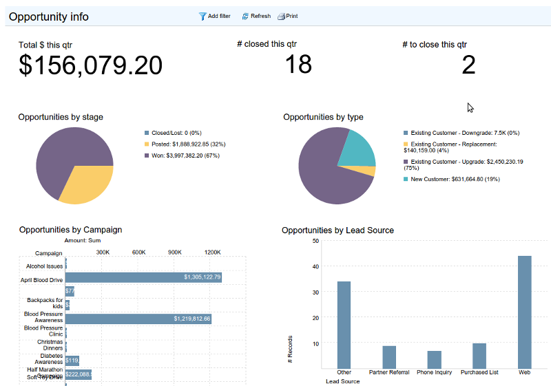
A dashboard is a collection of charts, KPIs, and pivot tables laid out on a page. Typically, you would aggregate a collection of related charts on a dashboard. For example, a service dashboard might include charts and KPIs showing Cases, Product information and related tasks, while a fund-raising dashboard might include charts showing donations or designations.
Charts #
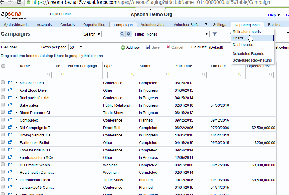
The chart editor enables creating and editing charts. It is available via the Reporting tools – Charts menu in Apsona.
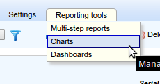
Managing charts #
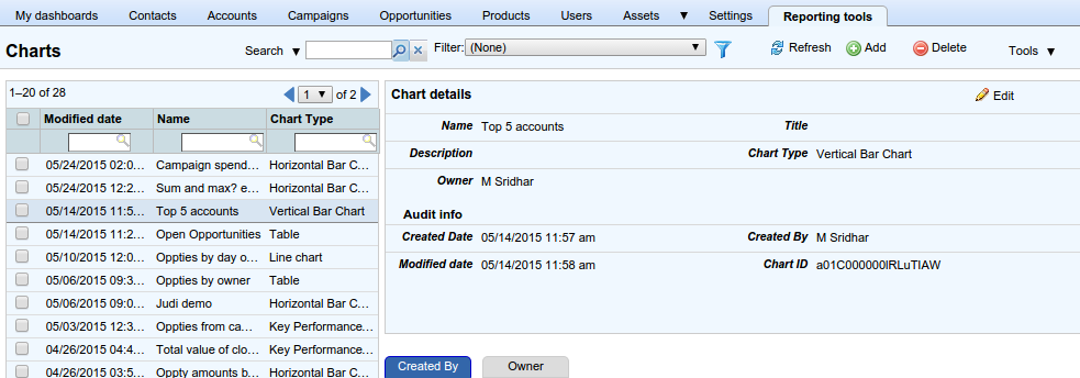
When you click the Reporting tools – Charts menu, you will see an Apsona console view of available charts. It contains a list of available charts on the left, and clicking any one of the items in the list displays the details of that chart on the right. With this console view, you can view your available charts, find a specific chart via its filtering feature, or rename or delete charts. Clicking the Edit button in the detail area of a chart opens the chart editor, using which you can edit a chart. Click the Add button at the top to open the chart editor for creating a new chart.
Creating and editing charts #
Broadly speaking, when creating a chart, we must specify
- the chart type we want (bar chart, pie chart, etc.)
- the data source that will provide the data records for the chart
- the columns of that data that should be used to create the chart.
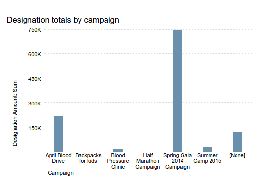
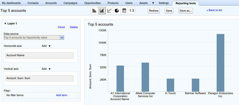
A chart depicts the way in which a specific measure, or metric value, varies according to a certain dimension. For example, in the bar chart below showing designation totals by campaign, the dimension is the list of campaign names, and the measure is the designation total. Here is a short demo video illustrating how to create a pie chart.
Chart types #
Within the chart editor, click one of the chart type buttons to select the type of chart you want.
- The horizontal bar chart, the vertical bar chart and the line chart support up to three layers (more about layers below).
- The pie chart uses the names of the dimension values as slice names, and the metric values as the angle sizes. It supports only one layer.
- A pivot table displays data pivoted according to the data columns you select. It supports only one layer.
- A values table displays data records exactly as produced by a report or multi-step report. It supports only one layer.
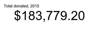
- A key performance indicator displays a single numeric value, such as a number or currency value. It supports only one layer.
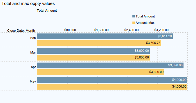
The horizontal and vertical bar charts and the line chart also support upto three metric values in the same chart, provided that the data types of those metrics are the same. For example, you can create a horizontal bar chart that uses the Opportunity stage as dimension, and the total and maximum opportunity values as well as the total expected opportunity value as metrics. Below is an example of such a chart with two metric values and one dimension.
Data sources #
The data source selector shows a list of available data sources from which you can select one. A data source can be any Salesforce native or custom object, any Apsona single-step report, or any Apsona multi-step report. (You will need a license for multi-step reports to use one as a data source.) Once you select a data source, the fields of that data source are available for use as dimensions and metrics for your charts. More specifically:
- with an object as data source, all of the object’s fields are available;
- with a single-step report as data source, all of the fields output by the report – including calculated fields – are available; and
- if the data source is a multi-step report, all the columns in the first block produced by the multi-step report, including calculated fields, are available.
Filtering #
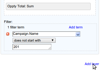
You can also apply filter terms on the the records returned by the data source, and when you do so, only the filtered list of records will be used by the chart. Note that, if you are using a report as data source, any filter you apply in the chart is additional to the filter that might already have been applied in the report.
Dimension fields #
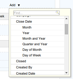
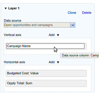
Dimension field values are used as the vertical axis values for a horizontal bar chart, and as horizontal axis values for a vertical bar chart or line chart. When you click the “Add” button above the axis values area of the chart, a dimension picker appears, listing the fields available as dimensions. The screen shot at right shows an example of a dimension picker. Dimension values can be:
- String fields. With a string field as dimension, the axis values will be the distinct values of that field as provided by the data source and filter. For example, suppose you were to use the Contact object as data source, and its Department field as dimension. The chart will then contain all of the distinct Department names in your database as axis values. You can, of course, filter these data values, in which case you will see just those Department names that are allowed by the filter.
- Picklist fields. If you select a picklist field as dimension, the distinct values of the picklist field will be used as axis values, but again, you can apply a filter to show just some picklist values and not all.
- Yes/No fields. With a yes/no (checkbox) field as dimension, there will be just two dimension values: “true” and “false.”
- Values derived from date fields. Specifically, any one of the following derived values of that field can serve as dimension: the year, the month, the month and year, the quarter and year, the day of month, and the day of week.
Metric fields #
The values of the metric field determine plot values of the chart, e.g., the lengths of the bar chart, or the angle of the pie chart. Metric values can be any of the following:
- The number of records returned by the filtered data source.
- For every numeric or currency field produced by the data source, the value, the sum, the minimum, maximum or average value of that field.
Renaming your fields #
Once you have added a field to the chart, you can change its name by simply clicking on it, as in the screen shot below. When you rename a field, the updated field name is used for the row or column labels of the chart where the field is used.
Some examples #
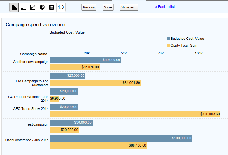
For example, suppose you have created an Opportunity report that produces the Campaign name, Campaign budget, and the total amount of Open opportunities. You can now create a chart whose dimension is the campaign name, and which uses two metrics: the value of the campaign budget and the sum of the values of the opportunity amounts. The result shows a comparison of campaign budgets with open opportunity revenues, thus enabling you to monitor your revenues compared with your spending. Below are two screen shots showing the chart and the corresponding report data source.

Layers #
One common use case for charts is to be able to compare similar-looking data from different data sources, in an effort to look for patterns. For example, suppose you suspect that there is a relationship between opportunities from partner accounts, languishing in a “Needs Analysis” stage, and the case creation rate from partner accounts. So you want to compare the Opportunity totals of “Needs Analysis” opportunities, by quarter, over the last year, with the numbers of cases created, by quarter, from partner accounts. The key difficulty here is that the two data sets being compared – cases and opportunities – have no common relationship your Salesforce database.
This is an example of a situation where the idea of chart layers is useful. For some charts – specifically, bar charts and line charts – you can create more than one “layer.” Each layer includes its own data source, dimension and metric fields, and filters. When rendering the chart, the bars or lines produced by each layer are overlaid onto the same chart area, so that you can compare all of the charts together. The layers do not need to have anything in common, except that:
- The dimension values used by all of the layers must be of the same type, e.g., they can all be of type “Quarter and year” derived from a date value. You cannot have one layer’s dimension of type “Account name” and select another layer’s dimension to be of type “Account Type.” The intuition here is that you can only compare similar kinds of things; the quarter-and-year of a Case’s Created Date is comparable to the quarter-and-year of an Opportunity’s Close Date, but an Account Name is not comparable to an Account Type.
- Similarly, the metric values of all the layers must be of the same type, i.e., they must all be numeric, or they must all be of type currency.
The chart editor lets you add new layers to a chart, and specify the data source, dimension and metric fields and filters for the new layer. To add a new layer, click the “Add layer” button at the bottom of the chart properties panel – see the screen shot below.
Pivot tables #
Pivot tables are commonly used for summarizing and visualizing data. As a simple example, you can use raw opportunity data containing the name, stage, type and amount, and create a pivot table that shows total amounts by type and stage. More commonly, pivot tables are used in to group data along multiple dimensions, and calculate summary values for dimension set.
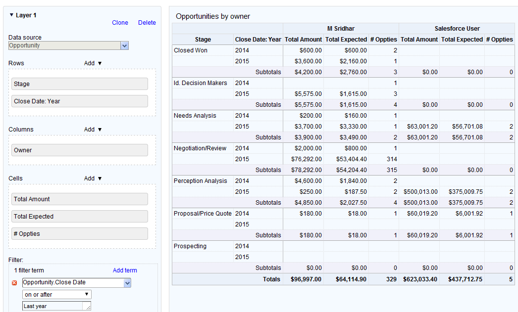
Apsona Charting treats the pivot table just like any other chart, in the sense that it can be created from any of the data sources, and can be embedded in a dashboard. The screen shot below shows an example of a pivot table illustrating some of the capabilities that Apsona Charting offers.
Notice the following.
- This table uses the Opportunity object directly as its data source, instead of relying on a separate report.
- This table uses two dimensions, Stage and Close Date: Year, for the rows, and the opportunity owner as dimension for the columns. Apsona Charting includes support for derived date dimensions such as Year, Month and Day of Week, and the above chart uses the year of the close date as one of the dimensions.
- It illustrates that you can use multiple summary values in the pivot. In this example, we have three different summary values selected in the “Cells” area on the left side, namely the Total Amount, the Total Expected and the number of opportunities. We therefore see three columns for each value of the Opportunity owner field.
- The pivot table automatically includes subtotals for each level-1 row as well as grand totals.
- In the left panel where you specify the dimensions and metrics, you can drag the fields ro rearrange them within the rows, the columns or the cells areas.
Dashboards #
Dashboards are created and managed via the dashboard editor, available via the Apsona menu Reporting tools – Dashboards. Clicking this menu brings up a console view of your available dashboards, so you can find available dashboards, delete them, add new ones or edit existing ones.
To edit a dashboard, click the Edit button in its detail panel to show the dashboard editor. To create a new dashboard, click the Add button in the dashboard list toolbar. The dashboard editor appears.
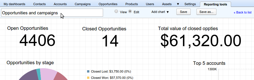
A tour of the dashboard editor #
Here is a short tour of the dashboard editor.
- Within the dashboard editor, a dashboard can be switched between “view” and “edit” modes. The “view” mode is provided so that you can see what the dashboard might look like to an end-user who does not have edit privileges on the dashboard.
- When creating a new dashboard, the dashboard editor opens with a dashboard named
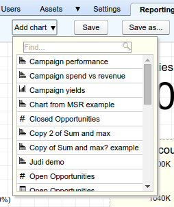
New dashboard. To edit the dashboard’s name, hover over the dashboard name, click and type the new name. Then click Save. - You can add a chart to the dashboard by clicking the “Add chart” button. This displays a searchable list of available charts. Click on one that you wish to add.
- To remove a chart from the dashboard, hover over it, and then click the red “delete” icon that appears at its top right corner. Note that such removal does not delete the chart itself; it simply removes the chart from the dashboard.
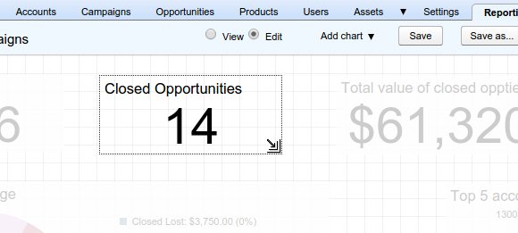
- To move or resize a chart, click on it. The selected chart will be highlighted and all the other charts in the dashboard will fade out, as in the screen shot below. You can then resize the chart by dragging the resize handle at its bottom right corner, or you can move the chart by dragging it. Note also that when in edit mode, a background grid is displayed so that you can drag your charts and align them along columns or rows according to your design. After moving or resizing your chart, simply click anywhere outside the chart to deselect it.
Sharing charts between dashboards #
- The same chart can be used in more than one dashboard.
- If you edit a chart and change its properties (e.g., the filter it uses, or the chart type it renders), that change will be reflected in all the dashboards in which the chart appears.
Viewing a dashboard #
Dashboards are available for viewing via the “My dashboards” menu.

You can determine whether or not to show a particular dashboard in this menu via the “Hide from Main Menu” checkbox. To do this, navigate to Reporting Tools – Dashboards and click the dashboard you wish to change. Then, in the Dashboard details panel on the right, check the “Hide from Main Menu” checkbox if you wish to hide the dashboard from the main menu bar. See screen shot below.

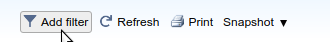
When viewing a dashboard, a toolbar offers functions for filtering the dashboard’s contents, printing its contents, and taking a snapshot.
Dashboard snapshots #
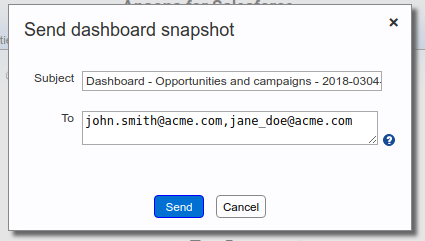
The “Snapshot” menu is intended to capture the current state of the dashboard as a snapshot. The menu enables downloading a snapshot (as an HTML file), copying a link to the snapshot so that you can share it with others, or emailing the snapshot as an attachment.
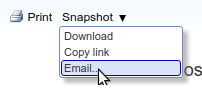
If you select the Email menu item, a popup window appears via which you can email the snapshot, with a subject and a list of recipient email addresses, as below.
Dashboards as Visualforce pages #
As an administrator, you can create a Visualforce page containing a dashboard, so that the dashboard can be shown either as a home page component or a related list.
Dashboard on the home page #
You can embed an Apsona dashboard in a home page layout, so that it appears on the main Salesforce home page of users who use that layout. To do this:
- Create a stand-alone Visualforce page for the dashboard, using the steps outlined below.
- Create a home page component using this Visualforce page, and add it to the home page layout in which you want it shown.
Dashboard as related list #
A dashboard can also be used as a related list, but only if all the charts in the dashboard are based on the same object. For example, suppose you have an Opportunities dashboard containing a number of charts, all of which use as data source either the Opportunity object, or reports on the Opportunity object. You can then use that dashboard as a related list of any object to which the Opportunity object has a lookup, e.g., the Account object or the Campaign object. When you create such a “related list dashboard”, the dashboard’s contents as shown in the detail page of the parent object will be limited to just the records related to the parent record. You can use this feature, for example, to monitor all the opportunities of a particular account via a collection of visual elements rather than raw data.
To create such a related list, you simply create a Visualforce page for the dashboard as a related list, using the steps described below. The generated Visualforce page then becomes available for use in the layout of the parent object.
Creating a Visualforce page for a dashboard #
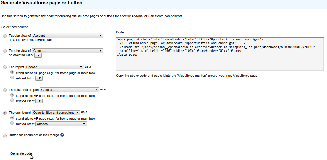
- In Apsona, navigate to Settings – VF pages and buttons. This page can be used to generate code for Visualforce pages.
- Click the radio button that selects dashboard pages.
- Select whether you want a stand-alone page or a related list of some object.
- Click the Generate button.
- Copy the generated code and paste it into your Visualforce page.
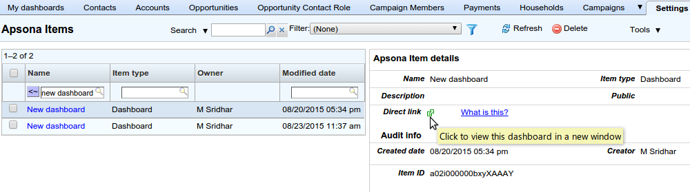
Direct link to a dashboard #
Dashboards have their own custom links you can use to share with other users. To find a dashboard’s link, click Settings – Apsona items, and find the dashboard’s record. Click the dashboard’s record in the list, and examine its “Direct link” field. The value of that field is the URL for the dashboard’s link. You can, for instance, copy the URL and share it with other users.